Part 1 of an 8-part series on building production-grade Shopify themes A custom Shopify theme is supposed to be a competitive advantage — faster pages, a design that actually…
Quick answer
Treat Shopify's sections and blocks model as the foundation of the theme, not an afterthought bolted on later.
Performance problems are almost always caused by render-blocking scripts, unoptimized images, and app bloat — not by Liquid itself.
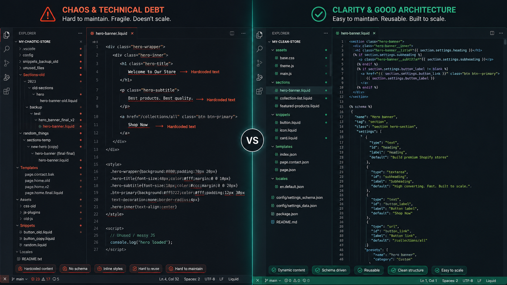
Hardcoding content into .liquid files instead of exposing it through schema settings creates a theme merchants can't actually manage.
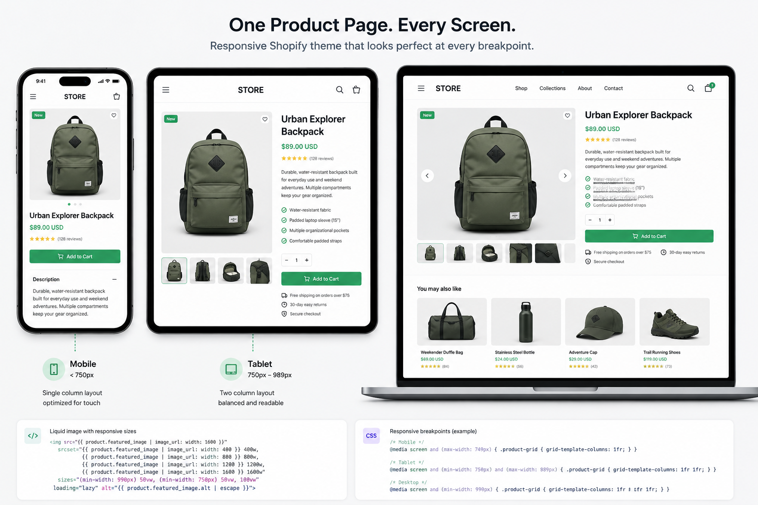
Skipping responsive and cross-device testing until the end guarantees a rebuild, not a fix.
Accessibility is not optional polish — it affects real customers and, increasingly, compliance requirements.
Online Store 2.0's JSON templates are frequently misunderstood, leading developers to fight the platform instead of using it.
1. Treating the Theme Like a Static Website Instead of a Liquid System
The most common root cause of a fragile Shopify theme is a mental model mismatch: developers coming from static HTML/CSS or WordPress backgrounds often build a Shopify theme the way they'd build a normal website — one big template per page, content typed directly into the markup. Shopify doesn't work that way, and fighting the platform's architecture is the single biggest source of technical debt in custom themes.
<!-- sections/hero.liquid — the "just get it done" version -->

<div class="hero">
  <h1>Summer Sale — Up to 50% Off</h1>
  <p>Shop our biggest collection drop of the year.</p>
  <a href="/collections/summer-sale" class="btn">Shop Now</a>
</div>
This renders fine. It also means every single copy change — a new headline, a different button link, a seasonal campaign — requires a developer to edit code and redeploy. Six months later, the client is emailing you to change one sentence.
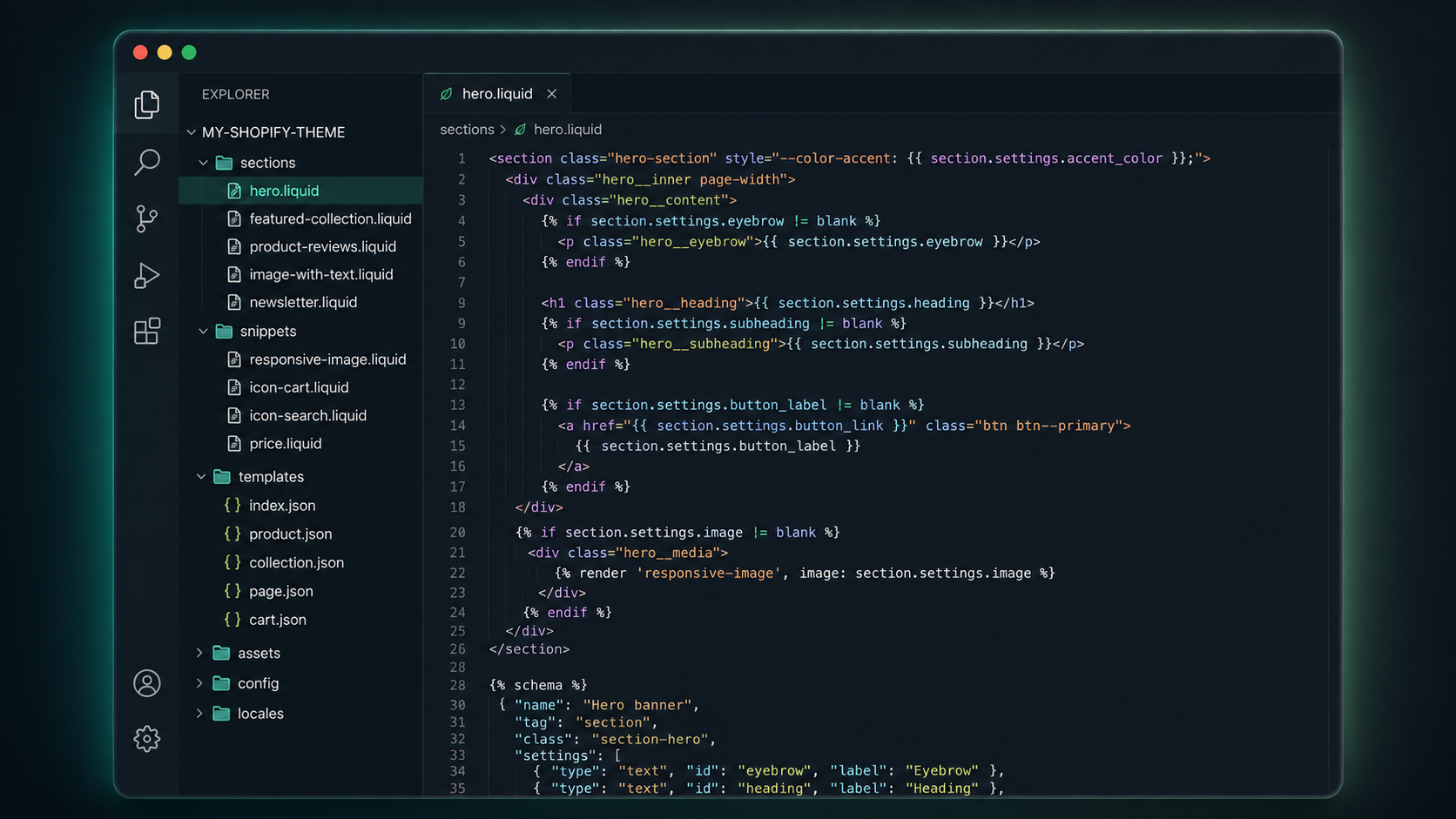
<div class="hero">
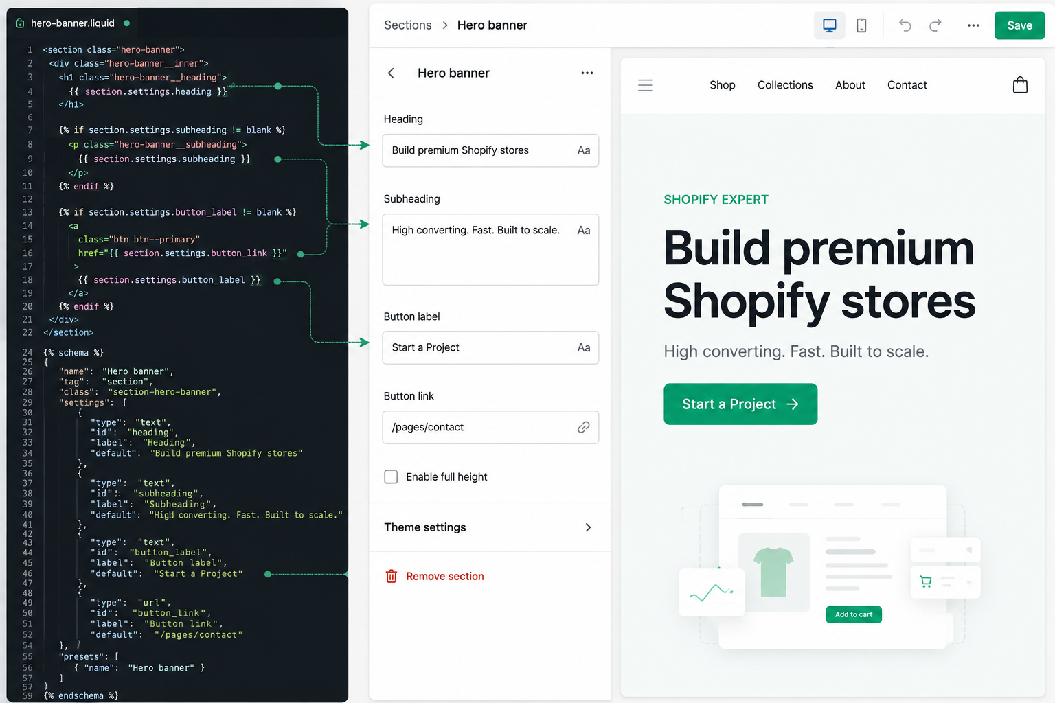
  <h1>{{ section.settings.heading }}</h1>
  {% if section.settings.subheading != blank %}
    <p>{{ section.settings.subheading }}</p>
  {% endif %}
  {% if section.settings.button_label != blank %}
    <a href="{{ section.settings.button_link }}" class="btn">
      {{ section.settings.button_label }}
    </a>
  {% endif %}
</div>
{% schema %}

{

  "name": "Hero banner",

  "settings": [
    { "type": "text", "id": "heading", "label": "Heading", "default": "Summer Sale — Up to 50% Off" },
    { "type": "text", "id": "subheading", "label": "Subheading" },
    { "type": "text", "id": "button_label", "label": "Button label", "default": "Shop Now" },
    { "type": "url", "id": "button_link", "label": "Button link" }
  ],

  "presets": [
    { "name": "Hero banner" }
  ]
}

{% endschema %}
Same visual result, but now the merchant edits everything from the theme customizer — no code, no deploy, no developer ticket for a headline change. This single habit change is responsible for more client satisfaction than almost anything else in this list.
2. Ignoring Performance Until It's a Problem
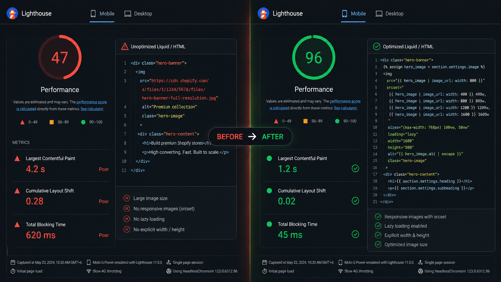
Shopify themes get judged on Core Web Vitals whether the merchant asks for it or not — it affects SEO ranking, mobile conversion rate, and, since 2023, is directly scored in the Online Store Speed Report inside the Shopify admin. Yet performance is almost always the last thing addressed in a build, if it's addressed at all.
The usual culprits are predictable:
- Unoptimized images. Full-resolution product photography served at hero-banner size, with no srcset, no lazy loading, and no explicit width/height (causing layout shift).
- Render-blocking JavaScript. Every third-party app — reviews, upsells, chat widgets — adds its own script tag to theme.liquid, often synchronously, often in <head>.
- Unused CSS shipped on every page. A single global stylesheet loaded on the cart page that also contains styles for the blog, the FAQ accordion, and three sections nobody uses anymore.
- Too many Liquid loops re-computing the same data. Looping over collection.products three times in three different sections instead of computing once and reusing.
{% assign img = product.featured_media.preview_image %}
<img
  src="{{ img | image_url: width: 800 }}"
  srcset="
    {{ img | image_url: width: 400 }} 400w,
    {{ img | image_url: width: 800 }} 800w,
    {{ img | image_url: width: 1200 }} 1200w
  "
  sizes="(min-width: 990px) 50vw, 100vw"
  width="{{ img.width }}"
  height="{{ img.height }}"
  loading="lazy"
  alt="{{ img.alt | escape }}"
>
3. Hardcoding Content That Should Be Merchant-Editable
{
  "name": "Featured collections",
  "max_blocks": 6,
  "blocks": [
    {
      "type": "collection",
      "name": "Collection",
      "settings": [
        { "type": "collection", "id": "collection", "label": "Collection" },
        { "type": "text", "id": "custom_title", "label": "Override title (optional)" }
      ]
    }
  ],
  "presets": [{ "name": "Featured collections" }]
}
4. Skipping Real Device Testing Until the End
- Tablet breakpoints (768px–1024px) are the most neglected range. Layouts that work at phone width and desktop width frequently break awkwardly in between — two-column grids that should be one, or three-column grids that should be two.
- Touch targets. A dropdown menu that works perfectly with a mouse hover often has no equivalent tap behavior on touch devices, quietly breaking navigation for the majority of Shopify's traffic, which is mobile.
- Sticky elements and safe areas. Sticky "Add to Cart" bars that ignore env(safe-area-inset-bottom) end up hidden behind the home-indicator bar on iOS devices.
- Font scaling. Fixed px font sizes that don't respond to a user's OS-level text-size settings, which is both a UX gap and an accessibility gap (see next section).
5. Treating Accessibility as Optional Polish
<!-- Common mistake: icon-only button with no accessible name -->
<button class="cart-icon">
  {% render 'icon-cart' %}
</button>
<!-- Fixed: -->
<button class="cart-icon" aria-label="Open cart, {{ cart.item_count }} items">
  {% render 'icon-cart' %}
</button>
- Color contrast ratios below WCAG AA (4.5:1 for body text) on brand-colored buttons and badges.
- Modals and drawers (cart, search, mobile nav) that don't trap focus or return focus to the triggering element on close.
- Missing alt text on product images — especially damaging on an e-commerce site, since product images often are the content.
- Carousels that autoplay with no pause control, which is a WCAG failure and also, frankly, an annoying UX pattern.
6. Misunderstanding Online Store 2.0's JSON Template Architecture
{
  "sections": {
    "main": {
      "type": "main-product",
      "settings": {}
    },
    "description": {
      "type": "product-description",
      "settings": {}
    },
    "reviews": {
      "type": "product-reviews",
      "settings": {}
    }
  },
  "order": ["main", "description", "reviews"]
}
Tools & Technologies Referenced
- Shopify Liquid
- Online Store 2.0 JSON templates
- Shopify Theme Customizer
- Metafields
- Lighthouse / Core Web Vitals
- WCAG 2.1 AA
Conclusion
- Common Mistakes in Shopify Custom Theme Development (this post)
- Shopify Theme Performance: A Real Optimization Workflow
- Mastering Sections, Blocks, and the Theme Customizer
- Metafields and Metaobjects for Structured Content
- Building Accessible Shopify Themes from the Ground Up
- Liquid Patterns Every Theme Developer Should Know
- Testing and QA Workflows for Shopify Themes
- Migrating a Legacy Theme to Online Store 2.0
Have a Shopify storefront that feels slower or harder to manage than it should? We build and audit custom Shopify themes end to end — get in touch and we'll take a look.
Part 1 of an 8-part series on building production-grade Shopify themes
A custom Shopify theme is supposed to be a competitive advantage — faster pages, a design that actually matches the brand, and a storefront that converts better than a stock theme ever could. In practice, a lot of custom themes end up slower, harder to maintain, and more fragile than the free themes they replaced.
That gap almost never comes from a lack of skill. It comes from a handful of decisions made early in the build — decisions that feel harmless in week one and become expensive by month three. This first article in the series walks through the mistakes we see most often in real Shopify theme projects, why they happen, and what to do instead. Later posts in this series will go deep on performance, Online Store 2.0 architecture, accessibility, and Liquid patterns — this one sets the foundation.